I’m on Android, so some of these may only be applicable to there.
I don’t totally remember my motivations for adding this page to the site initially, but here are some reasons I think it’s a good thing to have:
- Being able to notice problems is often a precursor to figuring out how to make things better, and more generally developing taste about what good looks like.
- I’d like providers of software, in particular, to hold themselves to a higher standard when putting products out there. This is a tiny bit of accountability for them to not have bugs or broken components.
- It’s plausible that AI systems in a couple of years will be able to solve most of the bugs or missing features
I encounter. So having a wishlist of things ready to go might be useful.
- One bottleneck here is that most of the issues I list here are with closed-source software, so I’d unfortunately still be reliant on the developers deciding to bother pushing a fix.
See also: Dan Luu on bugs.
Specific tweaks
-
Citymapper should have the options for “home” and “work” at the top, not the bottom
-
You should be able to see the guest list on Luma and Partiful before you RSVP (see Katja Grace’s blog post)
-
Microsoft Authenticator should let you search or reorder all the accounts you have OTPs set up for- Yay, as of 2024-09-28 they have fixed this in the beta version!
-
Typeform should let you toggle a view to see all questions, not just the current one
- They say it is to increase engagement, which might well be true, but it’s also annoying to have no sense of how long the form will be
- If it’s an application for something, I want to know what all the questions are before I start writing answers.
- A workaround is to put in fake answers and scroll down, but that’s just a waste of my time, particularly given that their smooth scroll is slow…
-
You should be able to switch between accounts in Airtable, rather than sign out entirely. Same on Claude.
-
The GOV.UK Self Assessment sign-in experience is annoyingly convoluted
- On the landing page gov.uk/self-assessment, the link to file your return is buried in a list of other links
- Once you get to the next page you have to scroll past almost all the page content to reach the “Sign in” button
- Even after signing in, you have to navigate further to reach the Self Assessment options, even though you’ve
come through a login flow specifically for that.
- It would be helpful to have a “dashboard” that tells you immediately after logging in what you need to do (e.g., make some payments, file for the last year, etc)
- State pension in self assessment
-
The new Bitwarden Chrome extension is worse than what it replaced
- Much slower
- The “select [password]” button is wider than the “save [login]” button when creating a new entry, so you have to carefully position
the cursor to be able to double-click
- It takes two clicks to copy a username or password, compared to previously just one
-
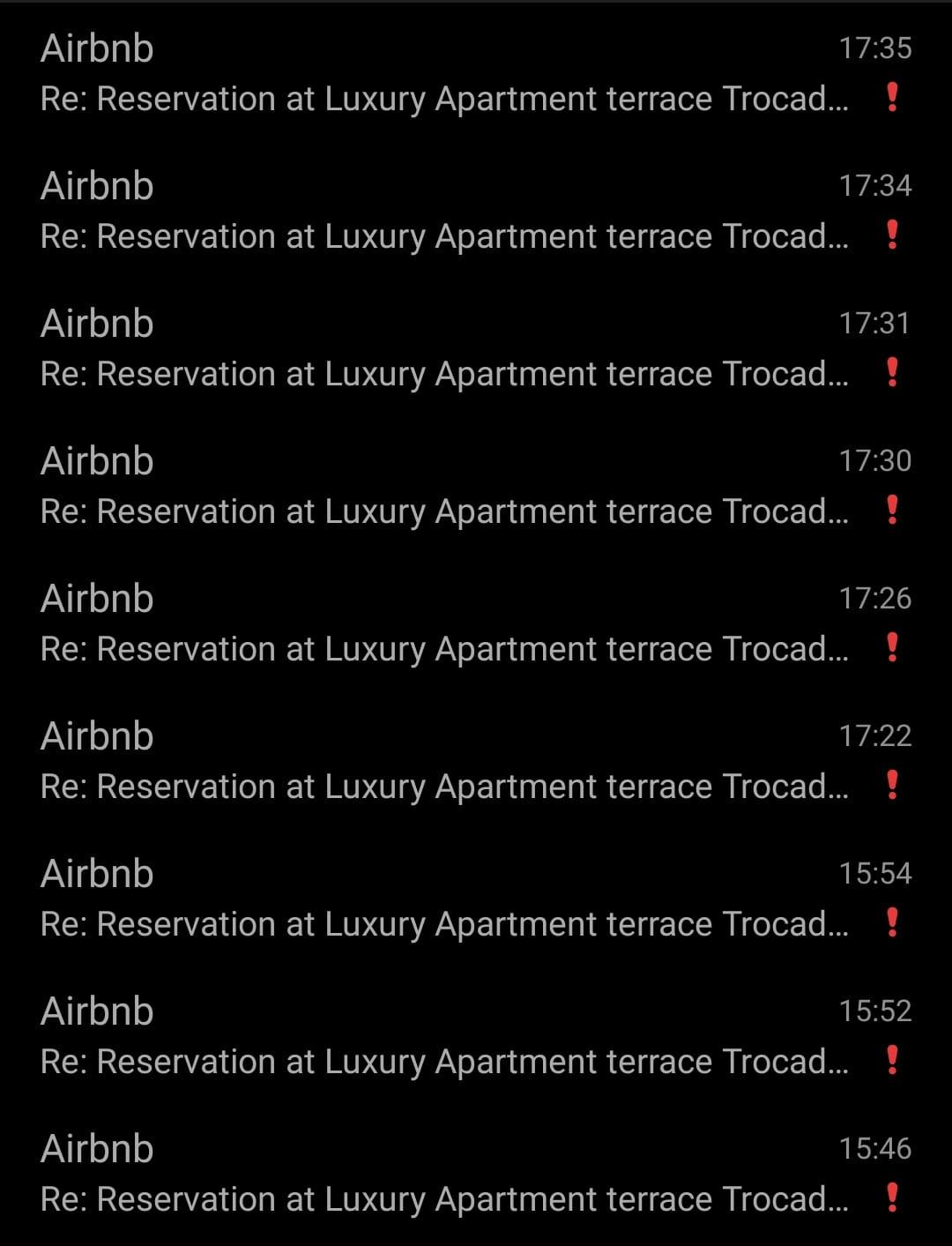
Not a single of these messages from Airbnb was useful, let alone important. Don’t pollute my inbox or attention!
-
Slack should let you click shift to skip modal confirmation pop-ups when deleting messages or clearing link embeds, like Discord does
- Also you should be able to quickly clear all link embeds on a message at once
-
There’s no indication on the Google Authenticator app that you swipe left to delete and swipe right to edit
-
Google Pixel
- The lack of a physical alert slider is frustrating.
- The notification shade quick actions are so much less information-dense than with OnePlus.
- e.g., for the internet tile it doesn’t tell you what network you’re connected to without a second tap. And to toggle between mobile data / WiFi, it takes two taps rather than just one!
- It’s not obvious how to turn on the camera flash – I had to go to Reddit for help.
- The “swipe to go home” navigation bar at the bottom of the screen wastes a precious few mm of space, whereas my old OnePlus has gesture navigation without that line at the bottom.
- You can’t double tap the lock screen to make it sleep, even though you can double tap to wake!
Broken things
- The Barclaycard app is terrible.
- If you have an existing account with them, you need to delete the app and reinstall it to apply for a new product. This seems absurdly stupid.
- The chat functionality does not work (and to reach it you need to click through the FAQs to reach a hidden section). Apparently they switched it off from 31 January 2025, but they still have it listed on their website…
Spotify only plays downloaded songs if in offline mode – if you just have no internet it complains about that and doesn’t realise that they’re downloaded- Yay, this has been fixed for a couple of months now (December 2024)
- When buying a train ticket through one of the operators directly (avoid needless Trainline fees; they add almost no value as far as I can tell),
you need a physical payment card to collect your ticket and often you’re not offered a digital ticket if going through the Tube
- Collecting at the ticket office works but that’s a waste of time and sometimes they’re shut
- aha: solution – use Google Pay, then they let you collect it without a card
- The Virgin Atlantic website is rubbish in many ways.
- Surnames are not allowed to have hyphens in them
- They ask you for security questions
- It is incredibly slow at retrieving bookings
- Seems incapable of automatically linking your booking to your frequent flyer account
- Logging into the frequent flyer account, it needs a surname as well as username and password
General points
- When web forms have a dropdown single-select option, you should be able to type into the field to filter options. Something like React Select solves this problem perfectly and is easy to implement.
- Although on desktop you can usually type and get to where you want, this isn’t possible on mobile because there’s no physical keyboard (and the virtual keyboard disappears once you focus on the dropdown).
- So, you have to scroll all the way to reach your option (and “United Kingdom” is a long way down in alphabetised lists…)
- Even worse is when you get to the bottom, see it’s not there, and then have to go back up to look more carefully for “Great Britain”, or “England”, or something else
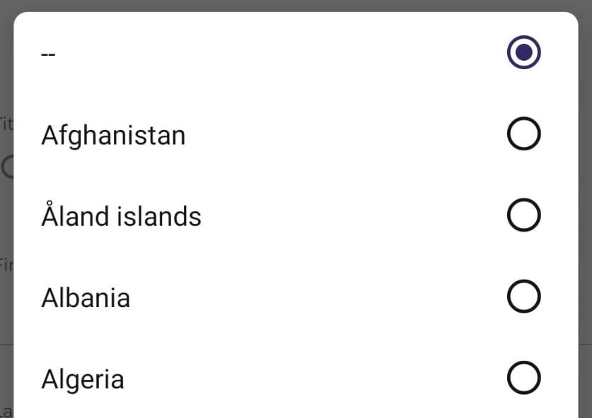
As seen on the Paris Musées website
- Two-page login screens are often annoying for password manager users – e.g. Airtable’s takes 1-2s to go from the email page to password one, and also they haven’t implemented a hidden field for my password to autofill into, which means I need to fill it twice.
- Various places online where people discuss the pros and cons
- I can see how the two-page pattern is helpful for people who use SSO or social sign-in and might get confused, but as a minimum the hidden field solution would make this accommodation less inconvenient to users like me
- Relatedly, it’s nice when websites have a combined sign up / login form, where if they don’t recognise your email address you get taken through to the registration page with your email and password choice prefilled
- I guess a security downside of this is that it leaks information about who’s already a user. But so too does giving feedback on failed login attempts more detailed than “email / password combination not recognised”, or telling users on the registration page “email address already taken”
- Since voice cloning is pretty much solved, banks definitely shouldn’t be using voice as an authentication method!
- e.g., Atom Bank does as of 2025-01-18